


Food should be more than fuel; it should be fun.
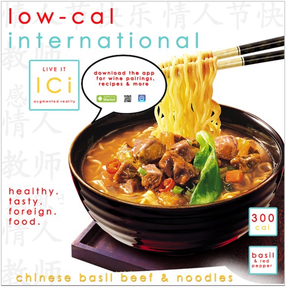
Low Cal International asked to be different, so different is what I gave them. Modern logos & slogans help pad this differentiation. Not only is the logo different, it is very representative of the product. Low Cal offers low calorie meals, so used lower case type. Also, I believe the logo looks like a placemat, fork, spoon, and plate; pretty clever, huh?
Food is better when it's fun.
Low Cal International will be set apart from its competitors by immersing the customer in ethnic cultures. By scanning the QR code, customers will be sent to an augmented reality that will teach them about the food, where it came from, how it is prepared, and even suggest wine or side dish pairings. Now frozen food can become more than convenient; it can be an adventure.

Magazine ads are great for high quality, bright images; so why not tantilize the curiosity of Cosmo or Food Network Magazine readers with this ad? I was assigned to create a campaign for a promotional sweepstake offer and this is the end result. I chose to hold true to the integrated campaign by incorporating a QR code for augmented reality in all marketing materials. That way, the type of customer we are targeting won't get bored and will want to be involved with everything Low Cal International does.


